
10 ICONIC ALBUM COVERS - BEYOND THE OBVIOUS
There are certain album covers that appear in almost every conversation about music and design.
Nirvana’s Nevermind. Pink Floyd’s The Dark Side of the Moon. The Beatles’ Abbey Road. Images that have become so deeply embedded in popular culture that they now exist far beyond the records themselves.
For this selection, we wanted to move away from the usual canon.
The covers gathered here are still iconic, but in a quieter, more particular way. Some are immediately recognisable. Others have shaped the visual language of a genre, an era or an artist without receiving the same level of mainstream attention.
Together, they show how album artwork can become a world of its own, connecting music with painting, photography, fashion, graphic design and cultural identity.
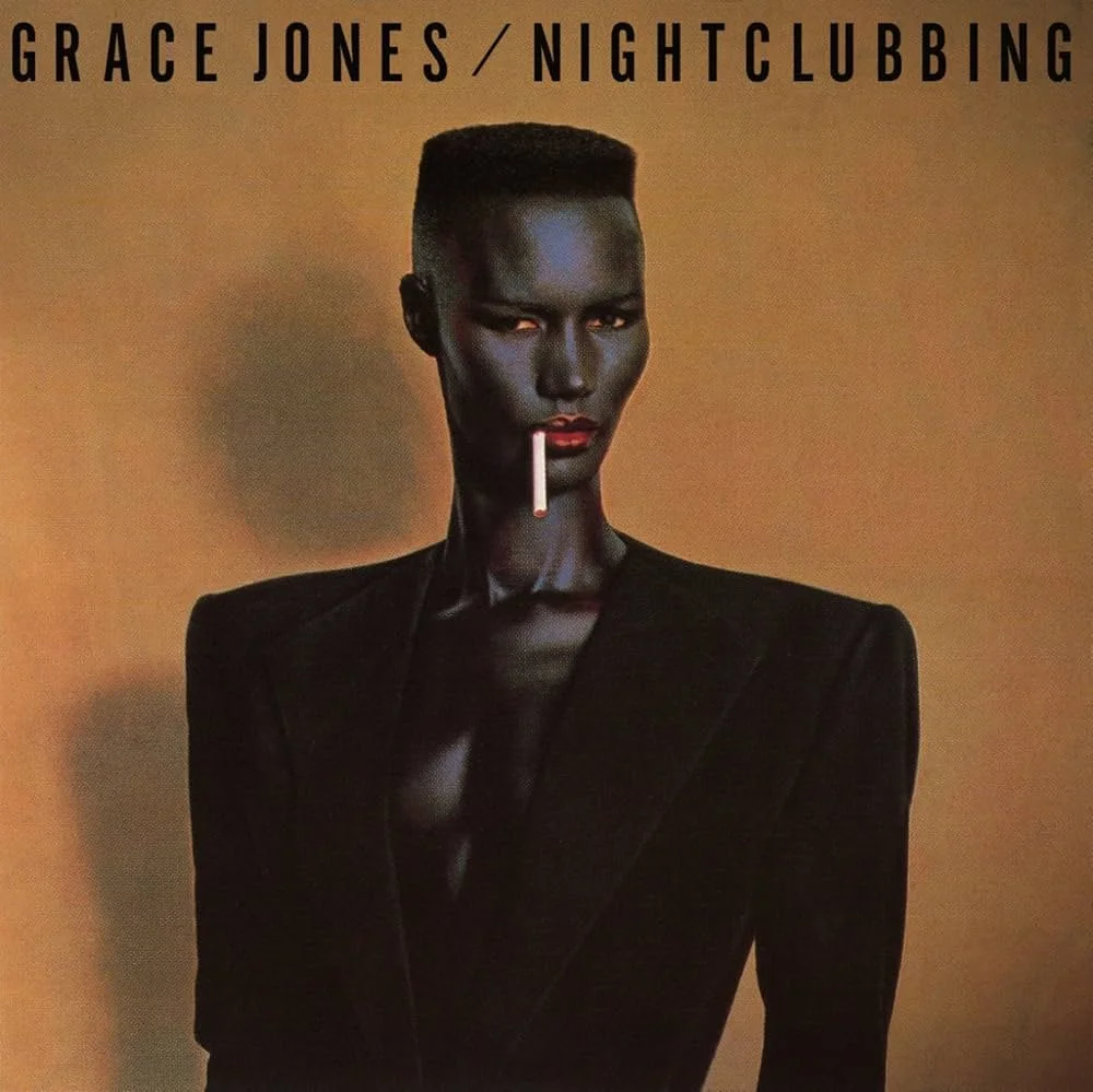
1. Bitches Brew — Miles Davis
1970
Mati Klarwein’s cover for Bitches Brew feels as expansive and disorienting as the music itself.
Faces, water, fire and cosmic landscapes merge into one continuous image. The composition resists a single reading, drawing the viewer into a visual world shaped by psychedelia, spirituality and transformation.
It remains one of the defining sleeves of jazz fusion, capturing a moment when Miles Davis was moving beyond established structures and into entirely new territory.
2. Abraxas — Santana
1970
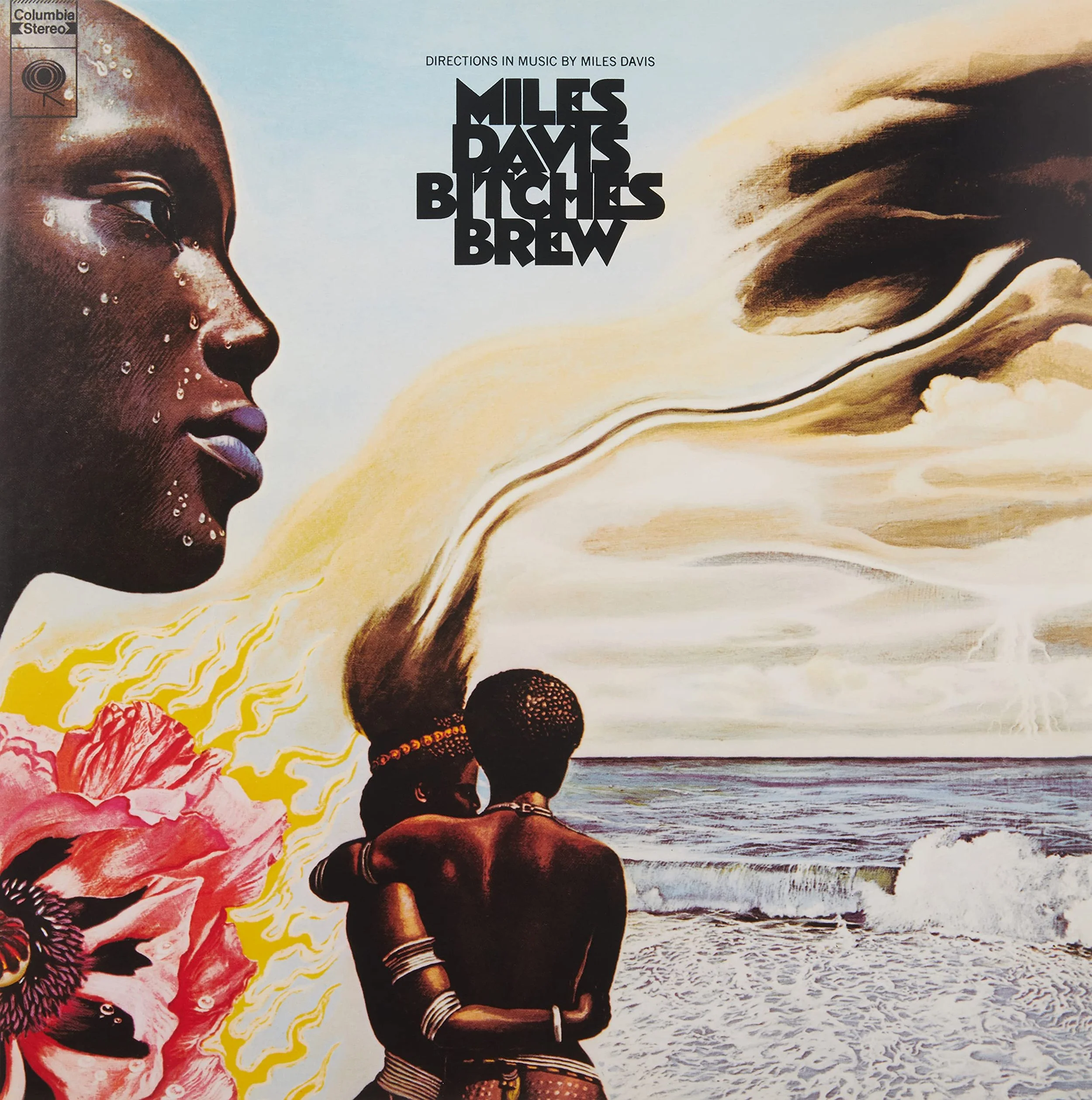
The artwork for Abraxas began as a painting by Mati Klarwein titled Annunciation.
Dense with colour, symbolism and surreal detail, the image reflects the album’s blend of Latin rhythm, rock, jazz and spiritual experimentation. It feels ceremonial and dreamlike, with every part of the composition contributing to its sense of mystery.
The cover has become inseparable from the music, representing the openness and visual imagination of the period.
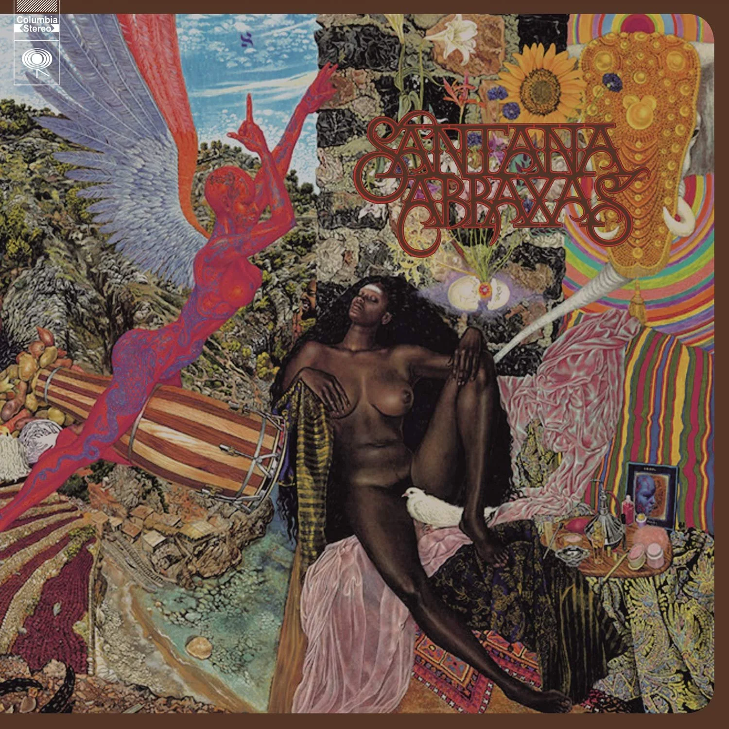
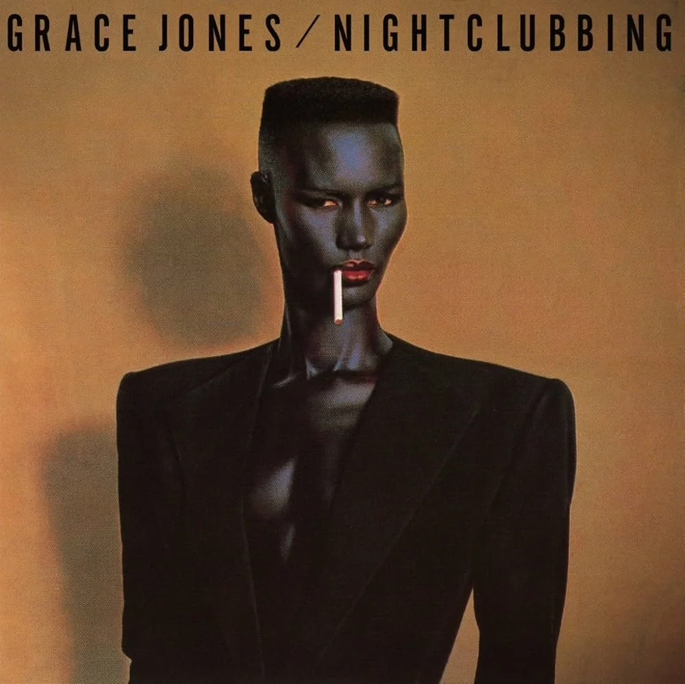
1981
Grace Jones appears against a dark background, wearing an Armani jacket with a cigarette held between her lips.
Photographed by Jean-Paul Goude, the image is severe, elegant and carefully constructed. Its strength lies in its restraint. Every line, angle and gesture contributes to a sense of control.
The cover helped establish Jones as far more than a recording artist. Music, fashion, performance and image became part of one complete identity.
3. Nightclubbing — Grace Jones
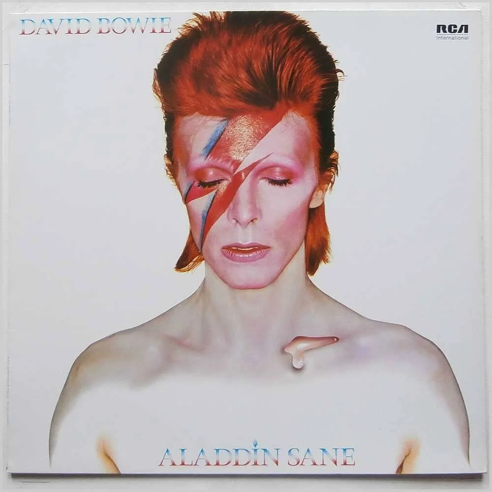
1973
Few portraits have created such an enduring musical identity.
Photographed by Brian Duffy, Bowie appears with red and blue lightning crossing his face, his eyes closed and his expression almost sculptural. The image is theatrical, controlled and instantly recognisable.
The lightning bolt became a symbol in its own right, defining one of Bowie’s most famous personas and influencing decades of fashion photography, performance and visual culture.
4. Aladdin Sane — David Bowie
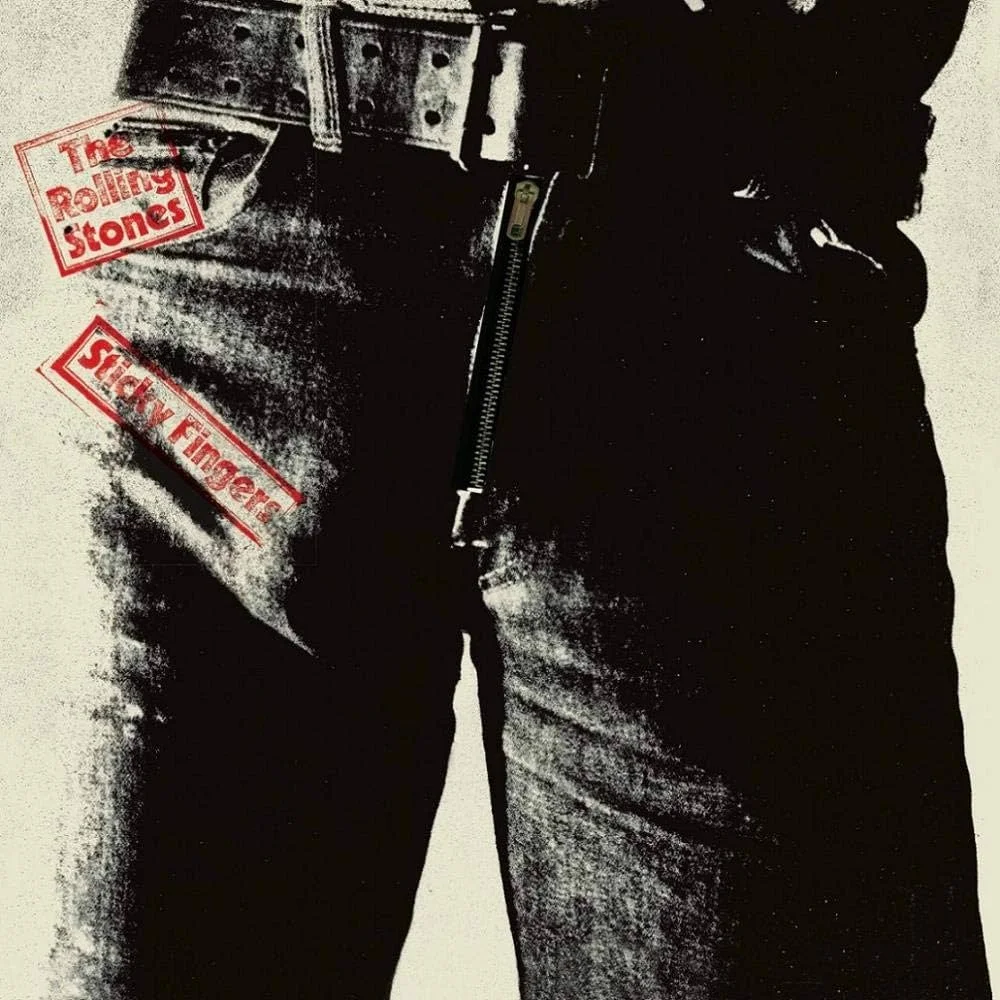
1971
Designed around a photograph by Andy Warhol, Sticky Fingers brought physicality directly into the record sleeve.
The original vinyl edition included a functioning zip, turning the cover into a tactile object rather than a flat image. It was provocative, playful and closely aligned with the band’s reputation.
The design also demonstrated how album packaging could become part of the artwork itself, inviting the listener to handle, open and interact with the sleeve.
5. Sticky Fingers — The Rolling Stones
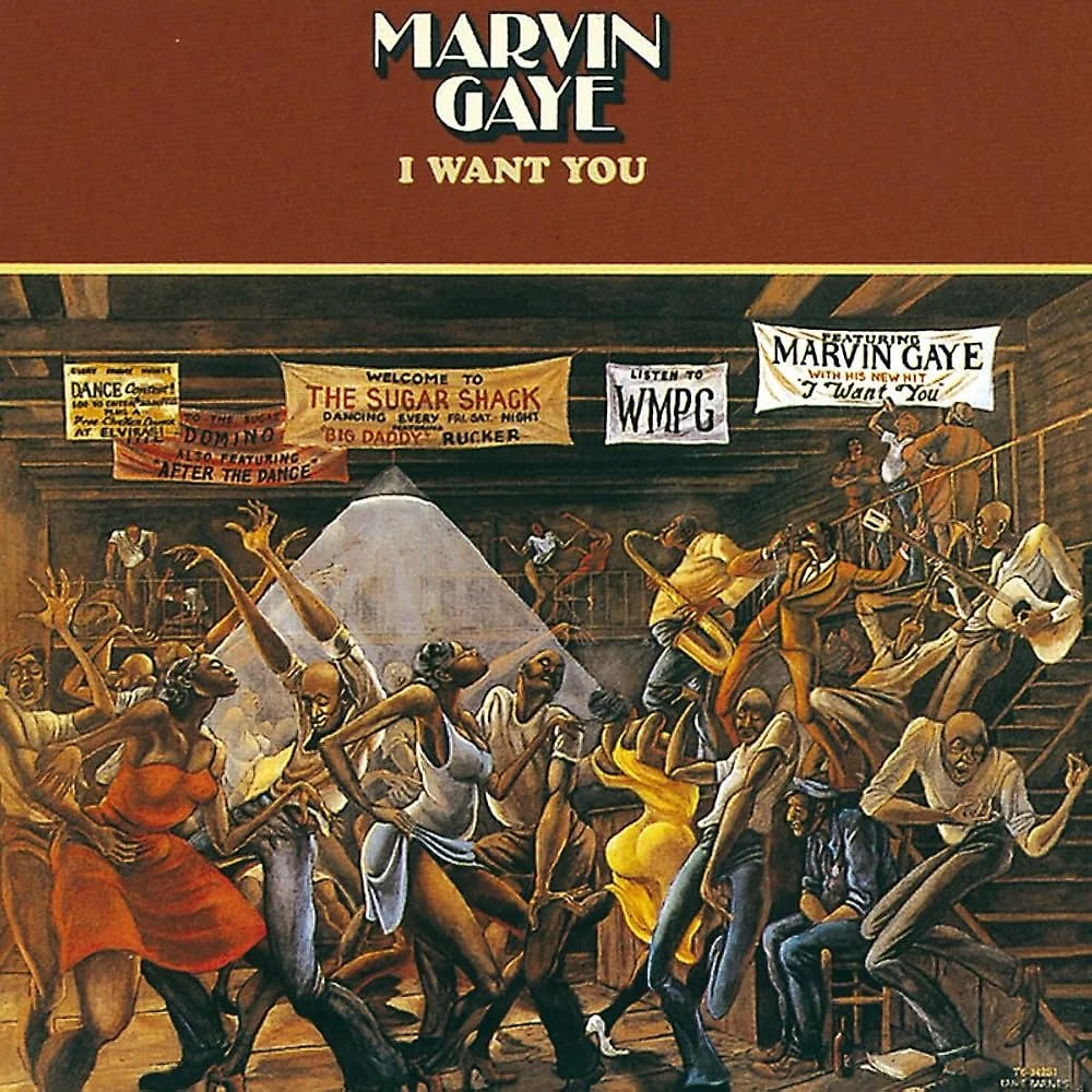
1976
The cover features Ernie Barnes’ painting The Sugar Shack, a crowded dance scene filled with elongated bodies, movement and energy.
Rather than focusing directly on Marvin Gaye, the artwork captures the atmosphere surrounding the music: intimacy, rhythm, desire and collective release.
The painting gives the album a social and emotional setting, making the sleeve feel alive before the record has even started.
6. I Want You — Marvin Gaye
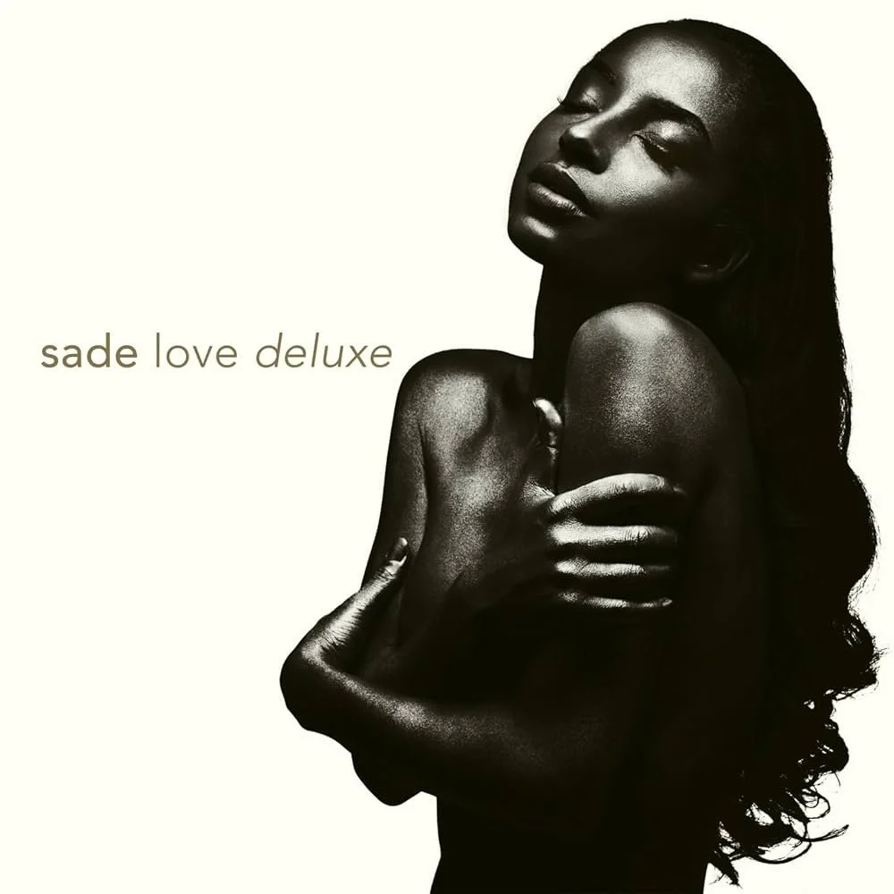
7. Love Deluxe — Sade
1992
The cover of Love Deluxe is quiet, minimal and entirely assured.
Sade Adu appears in profile, photographed against a deep background with very little visual interruption. The image relies on posture, light and expression rather than spectacle.
Its elegance mirrors the restraint of the music. The result is a cover that feels timeless, intimate and instantly connected to Sade’s wider visual identity.
8. Mezzanine — Massive Attack
1998
A black beetle appears against a white background.
The image is stark, precise and slightly unsettling. It offers no obvious explanation, yet it perfectly suits the atmosphere of the record: dark, controlled, organic and mechanical at the same time.
The cover became one of the clearest visual symbols of late-1990s electronic music, proving that a single object could carry an entire emotional world.

1997
For Homogenic, Björk appears as a ceremonial figure, transformed through costume, hair, makeup and digital manipulation.
The image was created through a collaboration involving photographer Nick Knight and designer Alexander McQueen. It combines references to tradition, fantasy, technology and armour.
The result feels both human and artificial, delicate and powerful. It captures the album’s central tension between emotional intensity and electronic precision.
9. Homogenic — Björk

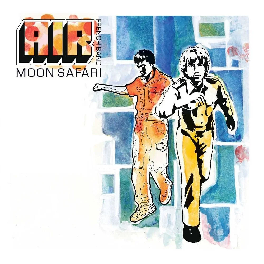
10. Moon Safari — Air
1998
The sleeve for Moon Safari presents a soft, retro-futurist world that feels both nostalgic and imagined.
Its smooth typography and dreamlike imagery reflect the album’s combination of analogue warmth, electronic production and cinematic atmosphere. The cover does not attempt to dominate the music. It creates a setting for it.
Like the record itself, it feels suspended somewhere between the past and the future.
THE IMAGE BEFORE SOUND
Album artwork has always done more than identify a record.
It creates expectation. It gives music a visual atmosphere and offers the listener a first point of entry. Long before the opening track begins, the sleeve has already started to shape the experience.
The covers in this selection may sit slightly outside the usual conversation, but each has built a lasting visual identity around the music it represents.
They remind us that the act of listening often begins with looking.